Thursday, April 22, 2010

Standardized Choropleth Map


http://www.statcan.gc.ca/pub/92f0138m/2008003/figures/5200001-eng.htm

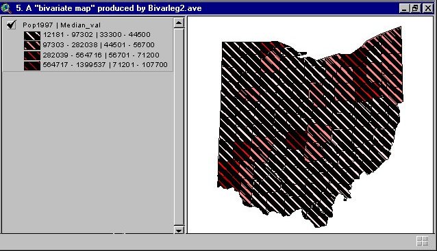
This is a standard choropleth map. Every area represented goes along with the key. There are no areas where the data is left out. The color is also the same throughout the map. In this particular map, it looks at the Canadian population and people under the age of 14.

Univariate Choropleth Map


http://www.ats.ucla.edu/stat/SAS/code/gmap.htm

This is a choropleth map that shows only one variable. In this case it is income. Although there are different colors, it is the same data that we are looking at.

Bivariate Choropleth Map


http://proceedings.esri.com/library/userconf/proc99/proceed/papers/pap171/p171.htm

This is a bivariate map. It is a choropleth map that shows two different types of data. There are stripes along with shaded states.

Classed Choropleth Map


http://www.cdc.gov/pcd/issues/2007/oct/07_0091.htm

This is a classed choropleth map. As you can see there is one color scheme that represents the data. The darker the shade, the higher the percentage.

Range Graded Proportional Circle Map


http://www.neiu.edu/~ejhowens/377/examples.htm

This is a version of a proportional circle map that shows the number of Mexican's in different states. Rather than have many circles, this map just has one per state.

DOQQ


http://www.crwr.utexas.edu/gis/gishydro00/Class/trmproj/Donnelly/termproject.htm

DOQQ maps are aerial views of the land. Each image shown by DOQQ should be the same size. This map has a infra-red color base. DOQQs can also be black and white.

DEM


http://rrsg.uct.ac.za/activities/activities.html


DEM stands for digital elevation model. In this specific example you can see that the red represents the highest elevation while the blue is the lowest.

DLG


http://ga.water.usgs.gov/olympics/columbus.html

This a DLG map of Columbus, Georgia. DLG maps show different pieces of information like roads, waterways, sewer systems, etc.. On this map you can tell that roads are black.

DRG


http://www.tceq.state.tx.us/gis/drg.html

This is a scanned image of an area along the Colorado River. DRG's are helpful when looking for certain data in different areas. You can see here that they have made the areas in red stand out for a certain reason.

Isopleth


http://www.globalchange.umich.edu/globalchange1/current/lectures/kling/water_nitro/water_and_nitrogen_cycles.htm


Isopleths show a certain amount of information that rangers over an area. In this map you can easily see which areas are sensitive to a certain point of information.

Isopach


http://seeps.geol.ucsb.edu/pages/isopach.html

Isopachs show the thickness of a land. This is crucial in trying to figure out which areas might have oil and what areas might not be as beneficial to drill at.

Isohyets


http://www.unu.edu/unupress/unupbooks/80391e/80391E03.htm

Isohyets show areas of similar amounts of rainfall. This particular isohyet shows India and their rainfall. As you can see, they have a lot of different amounts throughout the country.

Isotachs


http://www4.ncsu.edu/~nwsfo/storage/cases/20030123/

Isotachs show the wind direction and speeds in the atmosphere. The lines with little teeth show the way that the wind is blowing.


Isobars


http://www.newmediastudio.org/DataDiscovery/Hurr_ED_Center/Hurr_Structure_Energetics/Closed_Isobars/Closed_Isobars.html

Isobars deal with the atmospheric pressure. In this particular map we see the system over the Great Lakes. The numbers represent the different pressures.

LIDAR

http://www.treehugger.com/files/2007/06/3-d_forest_mapping.php

This is a LIDAR 3D representation of a forest. LIDAR uses light direction and ranging in order to find the elevation of the land.

Doppler Radar


http://www.weatherusa.net/blog/index.php?month=August_2004

This is a map of Florida that shows doppler radar. The doppler radar uses a microwave signal to determine the precipitation associated with a storm. The brighter the color, the heavier the rainfall.

Black and White Aerial Photo


http://freegeographytools.com/2007/goofing-around-with-pan-sharpening

This is a black and white aerial photo. It is pretty self explanatory as it shows the land below in a black and white theme. You can easily see roads and landscape such as trees.

Infrared Aerial Photo


http://www.aerialarchives.com/infrared.htm

This is an infrared aerial photo. Using these types of maps we can easily tell which type of land we are looking at. Using the infrared we can tell which areas are urban areas and which areas are more agricultural areas.

Unstandardized Area Choropleth Map


http://en.wikipedia.org/wiki/Choropleth_map

This is an unstandardized area choropleth map. Like other choropleth maps, they show data of different information using different colors. What makes it unstandardized is the non uniformed use of colors.

Cartographic Animations


http://uwacadweb.uwyo.edu/JSHINKER/animations/global/

This is a cartographic animation of radiation over the entire world. The key to cartographic animation is to show information over different periods of time. Here you can see that each month has a different image.

Bilateral Graph


http://www.gallup.com/poll/106858/chinas-leadership-better-regarded-outside-west.aspx

A bilateral graph shows two or more types of data next to each other in one graph. This one asks a group of people whether or not they agree with leadership in China. It is a good way to compare data.

Statistical Map


http://seattlebubble.com/blog/2006/09/11/mapping-housing-market-health/

A statistical map shows a statistic relative to the location it depicts. Here in this map it shows how much house value has decreased or increased. Giving a close look at the map, we can easily see that Michigan has the worst drop.

Lorenz Curve


http://www.answers.com/topic/lorenz-curve

A Lorenz curve shows the property distribution of wealth. This particular one breaks it down and shows how the line of equal distribution is not completely accurate despite the trend that is shown. It breaks down the wealth and who owns how much of the wealth in a country.

Cartogram


http://www.math.yorku.ca/SCS/Gallery/bright-ideas.html

This is a cartogram from the Bush/Kerry election. It misconstrued the map in order to show the population of the areas where people voted for each person. As you can see, the Northeast and West is greatly exaggerated due to the amount of people in each region.

Index Value Plot


http://onlamp.com/pub/a/onlamp/2005/11/17/r_for_statistics.html?page=2

This is an index value plot of the S&P 500. This graph is a good way to show information that spans over a period of time. As you can see this graph starts at the S&P's January 3, 1995 and goes to July 29, 2005.

Flow Map


http://www.lib.utexas.edu/maps/texas.html

This is a flow map of how trucks travel throughout the country. Flow maps show different routes and frequencies of how things travel. Another common flow map type involves air traffic.

Scatterplot


http://www.mzandee.net/~zandee/statistiek/stat-online/chapter4/pearson.html

This is a scatter plot comparing husbands' age to their wives' age. The husbands' ages are on the X axis while the wives' are on the Y axis. The point where they meet is where a dot is put on the graph. These are a good way to show trends.

Isoline Map


http://www.unu.edu/unupress/unupbooks/80157e/80157E09.htm

This is an isoline map. Isoline maps show the elevation of a certain land in a two dimensional representation. The lines are different levels and the numbers tell how high it is. This particular map is in China.

Population Profile


http://www.ifad.org/operations/regional/pf/aids_1.htm

This is a population profile of people in a certain area. This particular profile is looking at the amount of people with AIDs. This type of graph is a good way to show data about a population, easily breaking it down by male and female.

Proportional Circle Map


http://mapmaker.rutgers.edu/355/links.html

This is a proportional circle map of parts of Michigan, Indiana, Ohio, Wisconsin and Illinois. The circles show the population of the areas encompassed inside of the circles.

Climograph


http://www.colorado.edu/geography/extra/geogweb/manitousprings/intro/page2.html

This is a climograph for a city in Colorado. These graphs are extremely useful for looking at precipitation and temperature over the course of a year. With these graphs, it is very easy to look at the results as well.

Choropleth Map


http://my.ilstu.edu/~jrcarter/Geo204/Choro/Tom/

This is a choropleth map that shows the number of Latinos in the state of Florida. Choropleth maps show data by different variances of color. This a very easy way to look at a map and find results right away. As you can see in this map, Dade and two other counties have the most amount of Latinos.

Wind Rose


http://www.climate.washington.edu/climate.html

This is a wind rose of the city of Seattle. Wind roses are useful to show the wind speed and direction over a certain amount of time. Here you can see that the strongest wind blew to the south.

Dot Distribution Map


http://operationmilitarykids.ohio4h.org/resources/bycounty.html

This is a dot distribution map of military families in the state of Ohio. Each dot represents a family. The larger/darker clusters represent a high amount of military families in the area. These maps are very useful to look at population data.

Triangular Plot


http://www.ex-parrot.com/~chris/wwwitter/200504.html

This is a triangular plot of a vote broken down by three different groups of people. As you can see, triangular plots are a good way to look at something like this because it shows the trend and the data at the same time. It is extremely easy to visualize.

Propaganda Map


http://kuoest.wordpress.com/

This is a propaganda map of the world according to Ronald Reagan. I find it pretty humorous as it sort of shows an American bias and our view of the world (20 years ago). As you can see the Eastern Hemisphere is pretty much the USSR and oil. It might be a satire, but beliefs of the Reagan administration shaped this map.

Parallel Coordinate Graph


http://bdtnp.lbl.gov/Fly-Net/content/bid/pcx/ParallelCoordinates/ParallelCoordinates.html

This is a parallel coordinate graph. It is a way to show data amongst different variables. In this map the different colors represent the different datas and the vertical lines represent the different thing they test the data with.

Wednesday, April 21, 2010

Hypsometric Map


http://www.landkarten.aridocean.com/

This is a hypsometric map of France. As you can see this map shows elevation in different colors. The darker the brown the higher the elevation. Green areas are more shown as hills and flat lands and the water is shown blue. These are another way to easily look at land elevation.


Histogram


http://searchsoftwarequality.techtarget.com/sDefinition/0,,sid92_gci330729,00.html

This is a histogram of test scores of a final exam. As you can it is an easy way to arrange the data in order to see the general results. Looking at this we can easily see that the majority of students scored a 60 or higher (I feel bad for the 0-20 people).

PLSS Map


http://www.digital-topo-maps.com/mapcardpro/air-photos.shtml

This is a map of a town. PLSS maps are useful to show the different towns and the exact territory that they belong to. As you can see in this map, it shows how a river could be in three different towns or county.

Tuesday, April 20, 2010

Box Plot


http://www.math.sfu.ca/~cschwarz/Stat-301/Handouts/node35.html

This is a box blot of births by day of the week in Canada. Box plots show the average data along with the extremes of what we are looking to map. It is very useful for comparing data. Specifically in this map you can see that the day that has the most numbers of birth on average is Thursday.

Cadastral Map


http://uts.cc.utexas.edu/~wd/courses/373F/notes/lec03map.html

Cadastral maps show ownership of different pieces of land. Here is a map of a neighborhood and the different plots of land that is available to purchase/already purchased. These maps are useful for zoning purposes as it shows what property is yours and what is included in your ownership.

Stem and Leaf Plot


http://www.eduplace.com/math/mhm/5/06a/index.html

A stem and leaf plot is a great way to show data. In this specific example, we look at the ages of people who attended a family reunion. Rather than just listing every single age (which would get monotonous) all you do is list the stem and then put the leafs that go with it. Here you can see that the stems with the most people present were the 0 (kids) and 30 year olds.

Thematic Map


http://www.sou.edu/Geography/JONES/GEOG280/sample.htm

Thematic maps are useful for showing information about certain regions. In this case it is the states of the United States and the population percent change rate. These are very easy to read and useful in getting the point across to the people reading the maps.

Similarity Matrix


http://www.biomedcentral.com/1471-2164/8/353/figure/F5?highres=y

This is a similarity matrix of factors. It shows the correlations between two things. The dark red represents high similarity and no color equals no similarity. These are useful for comparing different data that is part of a certain project.

Topographic Map


http://pubs.usgs.gov/of/2003/ofr-03-100/fig3.html

Topographic maps show the elevation of the land. Here in this specific example it is Glacier Bay National Park. The lines and numbers show the different ranges of elevation. There are also lines that mean cliffs. In the water you can also see the deepness as indicated by the negative numbers.

Correlation Matrix

http://yin.che.wisc.edu/images.htm

This is a correlation matrix of phage T7 protein. It shows the behavior of how the proteins react when assembling with other phage proteins. The darker the red the more reaction it has. Oppositely, it the blue shows little reaction. These are very helpful when looking at scientific data.

Planimetric Map


http://edc2.usgs.gov/pubslists/nimamaps/topo.php

This is a planimetric map that just shows the horizontal properties of something. In this specific case it has the country of Iraq. This is an easy way to show things such as cities, railroads, roads, and anything else that might get cluttered if there was a map showing elevation.

Star Plot


http://en.wikipedia.org/wiki/Radar_chart

A star plot is a type of map that illustrates the results of different variables. For this map, NASA is trying to design something. These different designs all of their strengths and weaknesses, but this map is one that can help them look at the results easily and efficiently.

Mental Map


This map was taken from http://www.uky.edu/~ulack/Geo152/Syllabus152Fall05.htm. This map is a mental map. Mental maps come from the users head and portray how the creators view the world. This one is from someone who was drawing a map of their neighborhood. As you can see there are not factual waypoints, rather descriptions that help tell the map's story of the person's neighborhood.